MENU
: How does the art and science of data representation empower decision-makers, improve data understanding, and enhance communication in various fields?
I. Introduction
In the broad realm of data analysis, data representation stands as a pivotal process by unveiling the complexities of datasets to reveal patterns and insights that resonate with our inherent artistic sensibilities. This vital aspect of data representation relies on two fundamental methods: data visualization and data sonification.
Through visual depiction, data visualization helps us understand what data is, how it works, and why it's important. It's not just for analysis; it's great for telling narrative of that data in a more artistic and visually captivating approach. Data sonification, on the other hand, turns data into auditory signal. Auditory signal aka. sound is an effective sensory modality that could be utilized to understand data in a more immersive and accessible manner, offering unique opportunities for conveying information, enhancing perception experiences, and providing an additional layer of engagement beyond traditional visual or tactile methods. In a similar concept to data visualization, data sonification enhances the creative and compelling outcomes, presenting prominent joining of artistic representation and informative content. This essay sets out on a expedition to uncover the key elements of these methods and their distinct capabilities in creative expression.
II. Visioning data: Data Visualization
Data visualization serves as a dynamic field within the broader landscape of information analysis. As we delve into the complexities of transforming data into useful insights, it becomes clear that this area encompasses a wide range of technical approaches and purposes. Berinato's classification identifies four separate stages of data visualization—concept illustration, idea generation, visual discovery, and everyday dataviz—emphasizing the discipline's complex nature (Berinato, 2016). Each steps offers distinct methods for interacting with and communicating data, but they all require different planning, abilities, and goals. From prioritizing clarity and simplicity in idea illustration to fostering creativity through unconventional shapes in idea generation, and from confirming hypotheses to uncovering hidden patterns in visual discovery, to providing practical tools for everyday decision-making in everyday dataviz. These categories emphasize that there is no standard approach for converting data into visual representations. Data visualization proves to be a vital tool that goes beyond mere analysis, allowing us to explore and communicate complex ideas through artistic representation.
In the intersection of data and artistic expression, Refik Anadol stands as a prominent figure exemplifying data visualization with sophisticated and groundbreaking approach to new media and digital art. His practice transcends the constraints of traditional artistic mediums, employing data and technology to craft immersive visual experiences that resonate both emotionally and intellectually.
One noticeable example of Anadol's artwork is the The Seoul Haemong project, a collaborative project between Refik Anadol Studio, the DDP, and the City of Seoul. This public art installation transformed the DDP Building, designed by Zaha Hadid Architects, into a canvas for exploration. Utilizing artificial intelligence, the project gathered an extensive dataset consisting of 11 million data points, primarily composed of citizens' stories encapsulated in the form of archival and personal photographs and documents (Anadol, 2023) <fig.1>. Then, with this collected data, Anadol utilized AI to discern the interconnections among these personal visual memories as depicted in <fig.2>. At the end, this process culminated in the creation of a visual artistic representation through the mediums of audio-visual performance and architectural installation <fig.3>. This collection of narratives, offering both individual and communal perspectives, shed light on the city's historical narrative and its hopes for the future. The synthesis of these memories imagined alternate realities of Seoul, revealing the city's collective consciousness through interconnected individual stories. This project of Anadol’s serves as a compelling illustration of how data visualization can be seamlessly integrated into artistic creation, pushing the boundaries of conventional artistic expression.
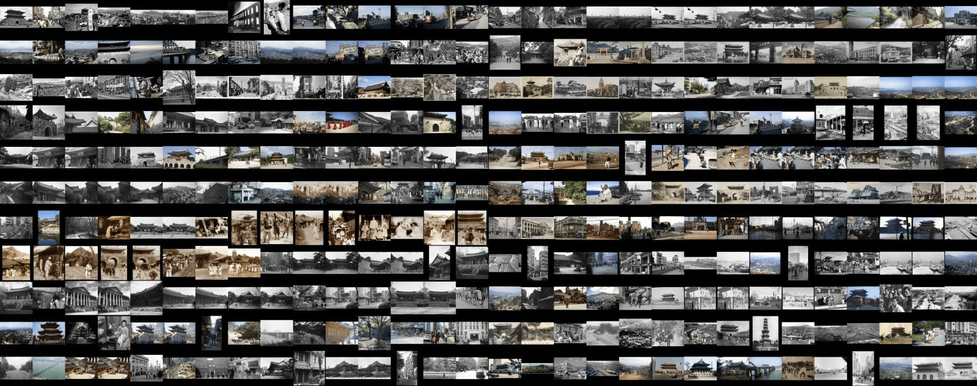

Fig.1, 11,050,511 Images of City of Seoul, Refik Anadol, Historic Dataset
Fig.1, 11,050,511 Images of City of Seoul, Refik Anadol, Historic Dataset
Fig.1, 11,050,511 Images of City of Seoul, Refik Anadol, Historic Dataset
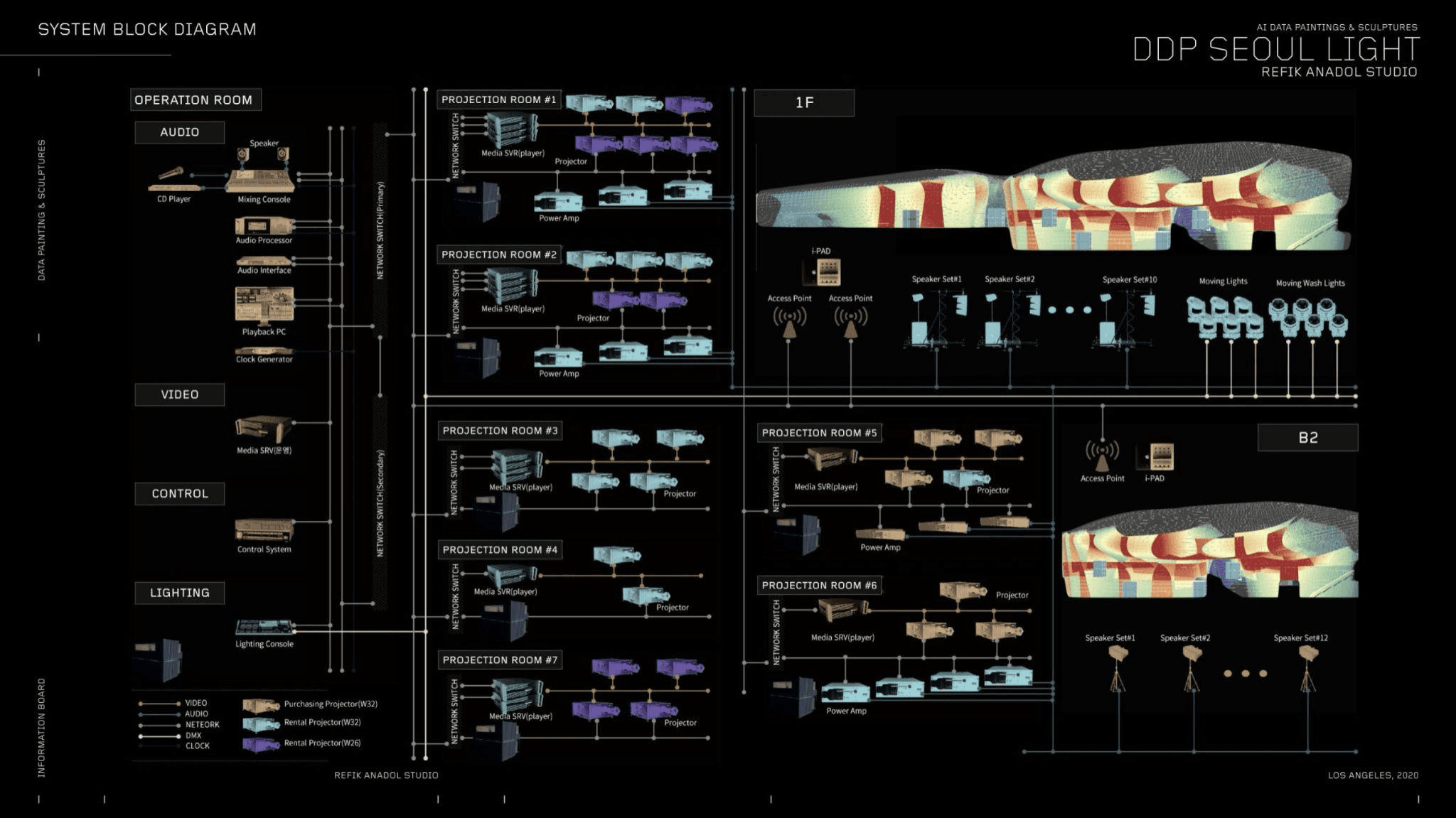

Fig.2, System Block Diagram, Refik Anadol
Fig.2, System Block Diagram, Refik Anadol
Fig.2, System Block Diagram, Refik Anadol
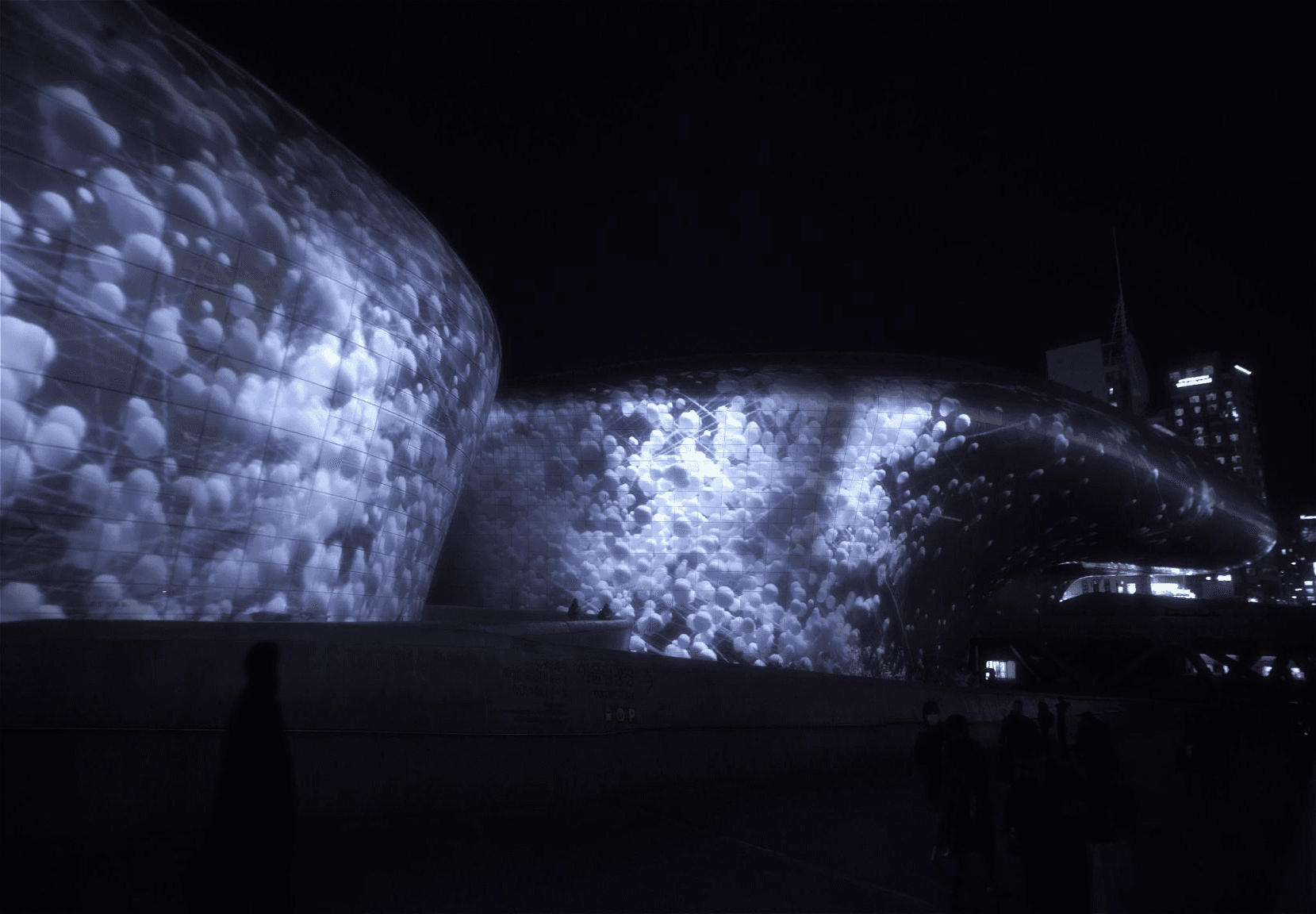

Fig.3, Seoul Haemong, Refik Anadol, Seoul 2021 A/V Performance, Installation, Public Art
Fig.3, Seoul Haemong, Refik Anadol, Seoul 2021 A/V Performance, Installation, Public Art
Fig.3, Seoul Haemong, Refik Anadol, Seoul 2021 A/V Performance, Installation, Public Art
Building upon this creative synergy, Federica Fragapane, a prominent data visual artist, draws parallels between crafting data visualizations and the act of writing in her article "Alive, Political Visual Words". She argues that data visualization is a creative and communicative process, introducing the concept of "visual alphabets and languages." In this analogy Fragapane underscores that data visualization is more than a technical endeavor; it's a creative and communicative one. Just as writers meticulously select words to convey ideas, emotions, and narratives, data visualization experts make thoughtful choices of visual elements to reveal the stories concealed within the data. For example, choice of colors can symbolize specific ideas, such as red for danger or urgency, green for nature and growth, and blue for security and wisdom. Furthermore, similar to grammatical norms in writing, this link extends to "visual languages," which include conventions, metaphors, and design principles that control how data is represented (Fragapane, 2023). These choices underlines that data encompasses more than just numbers; it encompasses real people, events, and narratives. Utilizing these distinctive selection, extending beyond basic charts, enhances the effectiveness of communicating data.
Beyond this structure of visualization, data visualization can also convey political or social meanings, adding depth to its narrative power. Drawing from the insights of "Data Feminism" by Catherine D'Ignazio and Lauren F. Klein, they noted that unconventional and "soft" shapes may be associated with a more "feminine" quality in the context of data visualization. This highlights how the traditional, male-dominated approaches to data visualization have historically been perceived as more valid, while elements such as emotion, affect, and decoration, often linked to femininity, have been devalued (D’Ignazio & Klein, 2020). This observation of D’Ignazio and Klein, underscores the importance to reconsider the biases and cultural associations that influence our visual comprehension of data.
The practitioner's journey into data visualization serves as a reminder that the practice is not merely about the end result but encompasses the entire process of selection, creation, and presentation. It challenges us to think critically about our design choices, consider the biases attached to specific visual styles, and reflect on the cultural associations that influence our perception of data. This diversity acknowledges that data visualization is a multifaceted landscape with a range of techniques and visual languages tailored to specific needs.
III. Audifying Data: Data Sonification
Sonification is the process of translating data into sound, where sound serves to represent the objective properties or relationships within the input data. This input data can take various forms, ranging from purely quantitative or qualitative data to images and even pre-existing sounds. These diverse data forms undergo analysis and manipulation tailored to their specific purpose and context, resulting in an acoustic or audio signal. For example, when dealing with quantitative data involving numeric values like height, weight, temperature, or counts, the collected datasets are transformed into sound. This means that numerical values, in this case, get sonified into audible representations.
Moreover, as the data undergoes analysis and manipulation, auditory and voice modalities demonstrate exceptional proficiency in processing verbal and categorical information. Known as parallel listening, auditory perception enables the simultaneous monitoring of several datasets. This ability proves particularly beneficial in high-stress situations, aiding in the swift detection of information (Flowers, 2005). Through the use of appropriate mappings, intricate multivariate data becomes more understandable, facilitating quick comprehension and the effortless identification of crucial events or specific data streams amid a multitude of others.
Data sonification is often employed to provide a perceptual experience of data through the sense of hearing, particularly in situations where visual representation is impractical or unavailable, mostly in scientific contexts. However, with the evolution of computer music and advancements in sound-generating technology, sonification has found artistic applications, contributing to musical compositions. Consequently, sonification can take various types of data and generate sound representations in diverse functions and forms.
Fig.4, Stephan’s Quintet Sonification, NASA, 2023, Link
Fig.4, Stephan’s Quintet Sonification, NASA, 2023, Link
Fig.4, Stephan’s Quintet Sonification, NASA, 2023, Link
Sonification is not only a creative endeavor but also serves as a valuable tool for deciphering complex data and identifying critical events. The recent example of NASA's sonification project (fig.4) demonstrates the application of these principles in astronomy. In this project, digital data captured by telescopes — most of which is invisible to our unaided eyes — is translated into musical notes and sounds. In specific, a depiction of Stephan’s Quintet captured by the James Webb Space Telescope incorporates infrared light in various colors, including red, orange, yellow, green, and blue, with supplementary data from the Spitzer Space Telescope represented in red, green, and blue, and X-ray light from Chandra depicted in light blue (NASA 2023). The sonification process of this data initiates from the top and scans down the image. The pitch undergoes changes as the cursor moves, correlating with the brightness in distinct ways. The visual elements, such as background galaxies and foreground stars in the images captured by Webb, are assigned different notes on a synthetic glass marimba (NASA 2023). In brief, each layer of sound corresponds to specific wavelengths of light detected by these telescopes, creating a unique auditory representation of astronomical phenomena. This innovative approach to data representation, where auditory displays offer an alternative to visual displays, proves particularly valuable in situations where visual representation is impractical, such as the vast and intricate data accumulated through technological advancements. In conclusion, sonification emerges as a flexible instrument with applications ranging from artistic expression to scientific discovery to practical problem-solving in a variety of disciplines, utilizing the auditory sense to turn complex data into meaningful and accessible information.
Sonification is not only a creative endeavor but also serves as a valuable tool for deciphering complex data and identifying critical events. The recent example of NASA's sonification project (fig.4) demonstrates the application of these principles in astronomy. In this project, digital data captured by telescopes — most of which is invisible to our unaided eyes — is translated into musical notes and sounds. In specific, a depiction of Stephan’s Quintet captured by the James Webb Space Telescope incorporates infrared light in various colors, including red, orange, yellow, green, and blue, with supplementary data from the Spitzer Space Telescope represented in red, green, and blue, and X-ray light from Chandra depicted in light blue (NASA 2023). The sonification process of this data initiates from the top and scans down the image. The pitch undergoes changes as the cursor moves, correlating with the brightness in distinct ways. The visual elements, such as background galaxies and foreground stars in the images captured by Webb, are assigned different notes on a synthetic glass marimba (NASA 2023). In brief, each layer of sound corresponds to specific wavelengths of light detected by these telescopes, creating a unique auditory representation of astronomical phenomena. This innovative approach to data representation, where auditory displays offer an alternative to visual displays, proves particularly valuable in situations where visual representation is impractical, such as the vast and intricate data accumulated through technological advancements. In conclusion, sonification emerges as a flexible instrument with applications ranging from artistic expression to scientific discovery to practical problem-solving in a variety of disciplines, utilizing the auditory sense to turn complex data into meaningful and accessible information.
IV. Resonance of data visualization and data sonification
IV. Resonance of data visualization and data sonification
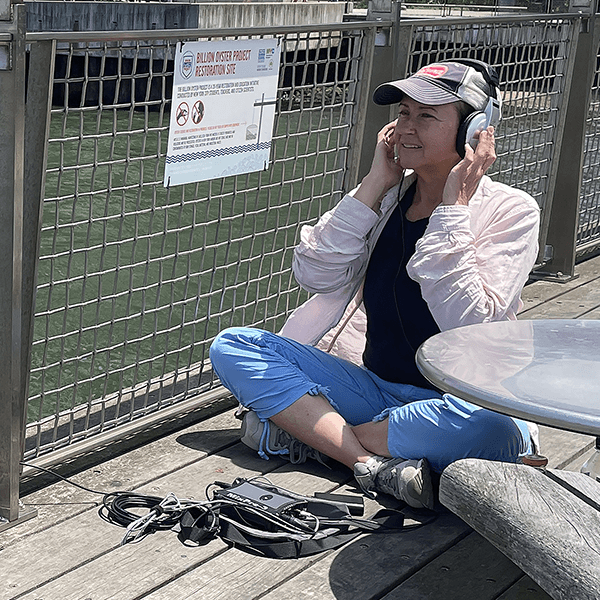

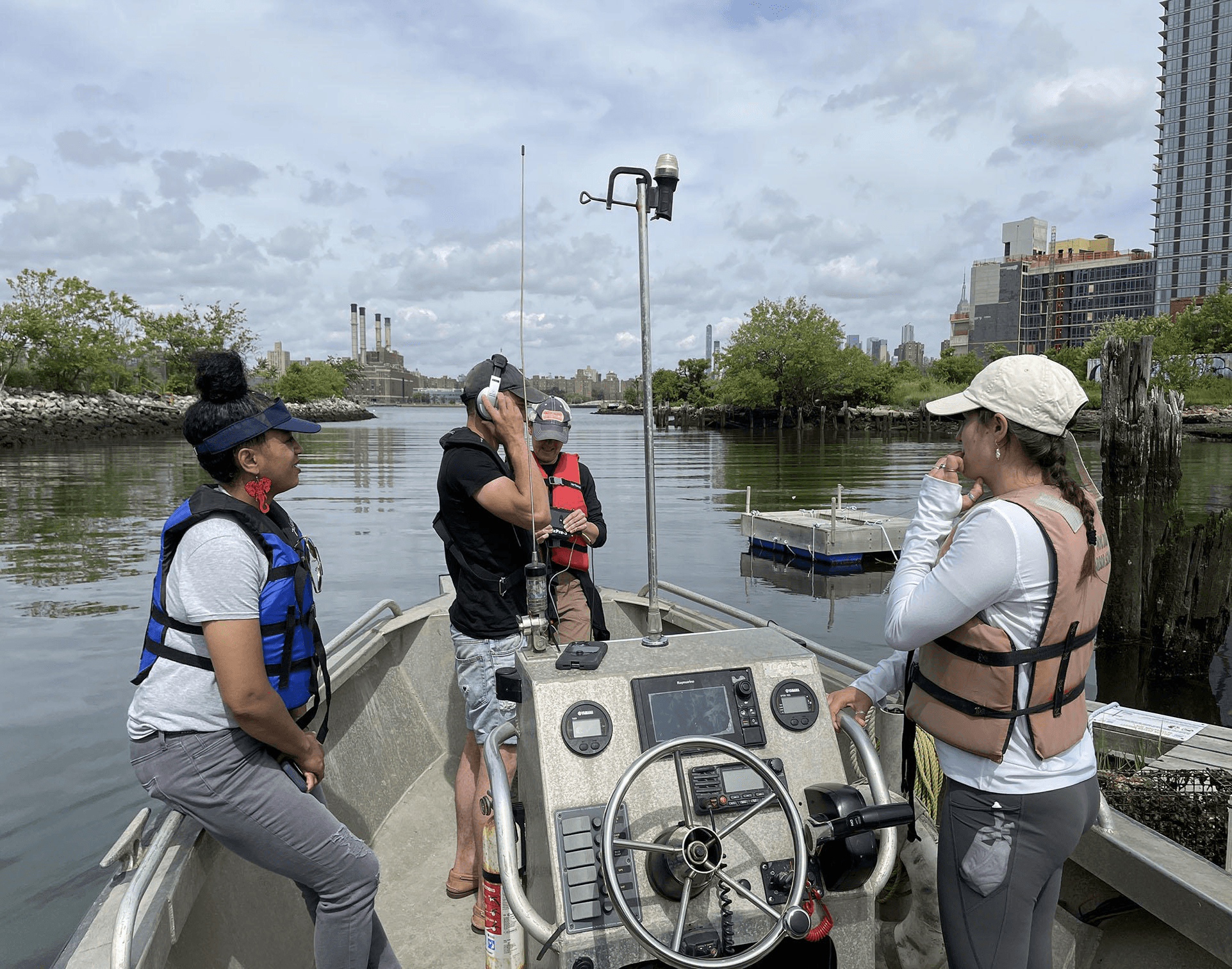

Fig.5 & Fig.6, Thorpe recording at the Billion Oyster Project’s Williamsburg Field Station. Photo by Stephanie Rothenberg
Fig.5 & Fig.6, Thorpe recording at the Billion Oyster Project’s Williamsburg Field Station. Photo by Stephanie Rothenberg
Fig.5 & Fig.6, Thorpe recording at the Billion Oyster Project’s Williamsburg Field Station. Photo by Stephanie Rothenberg
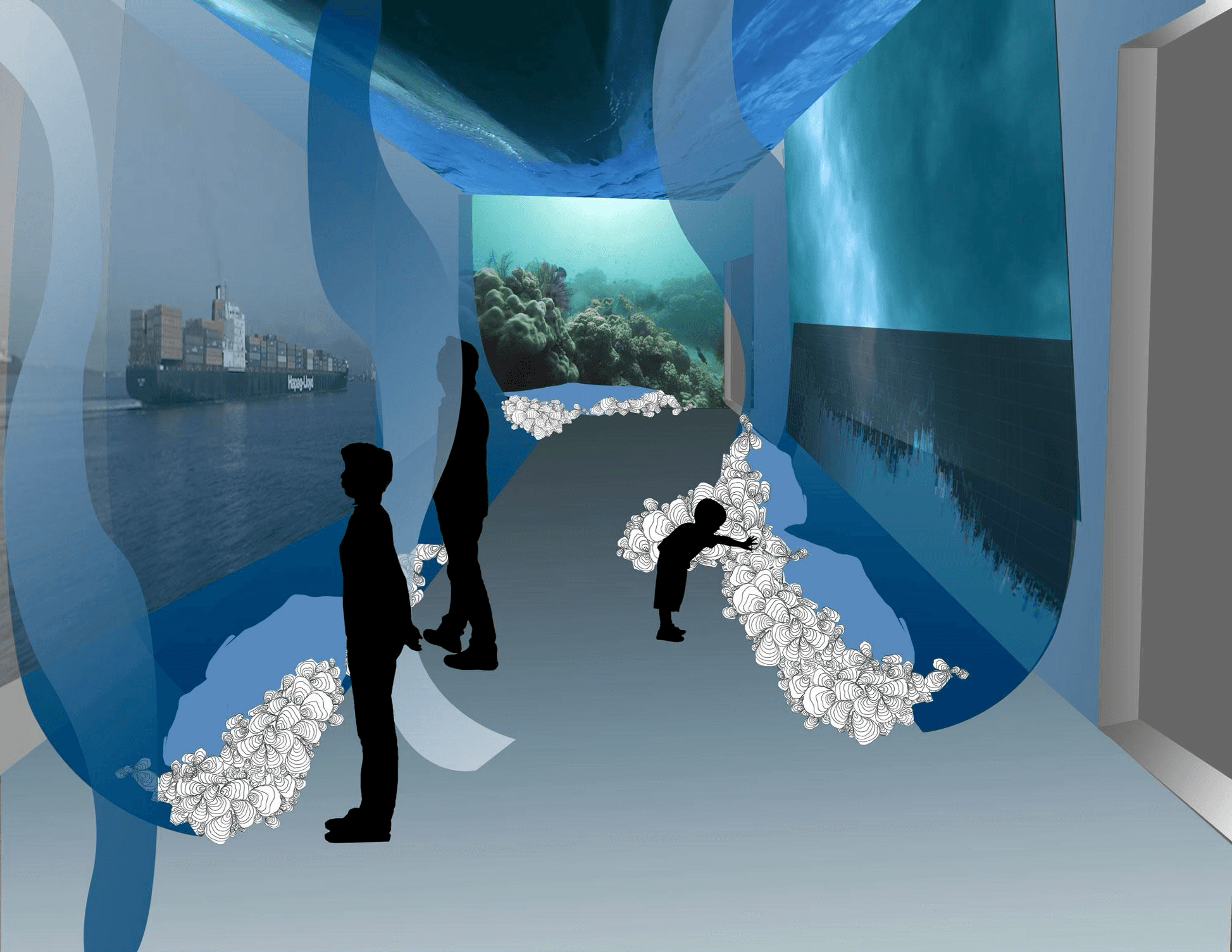

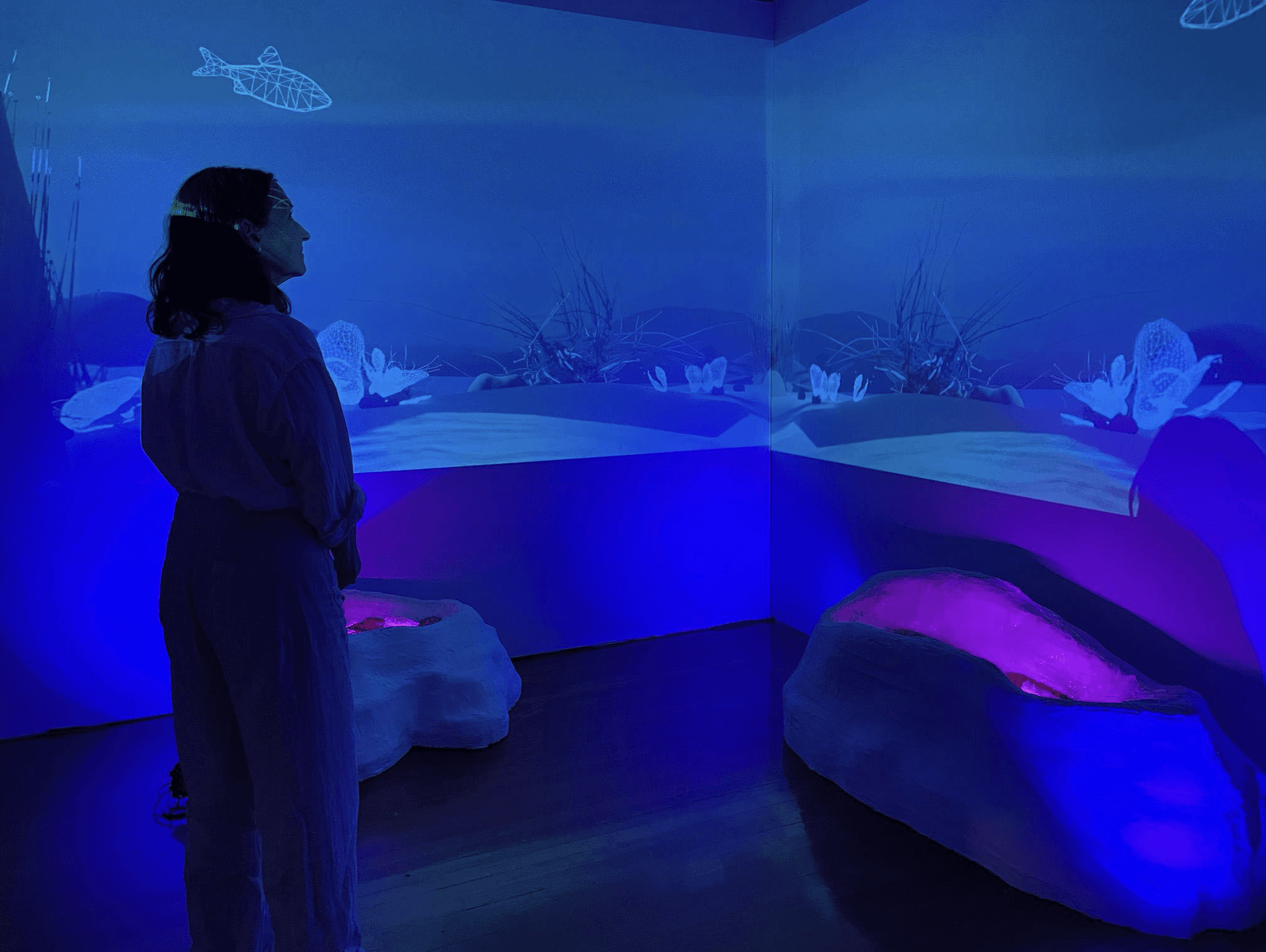

Fig.7 & Fig.8, Sketch of immersive installation designs and multi sensory exhibition
Fig.7 & Fig.8, Sketch of immersive installation designs and multi sensory exhibition
Fig.7 & Fig.8, Sketch of immersive installation designs and multi sensory exhibition
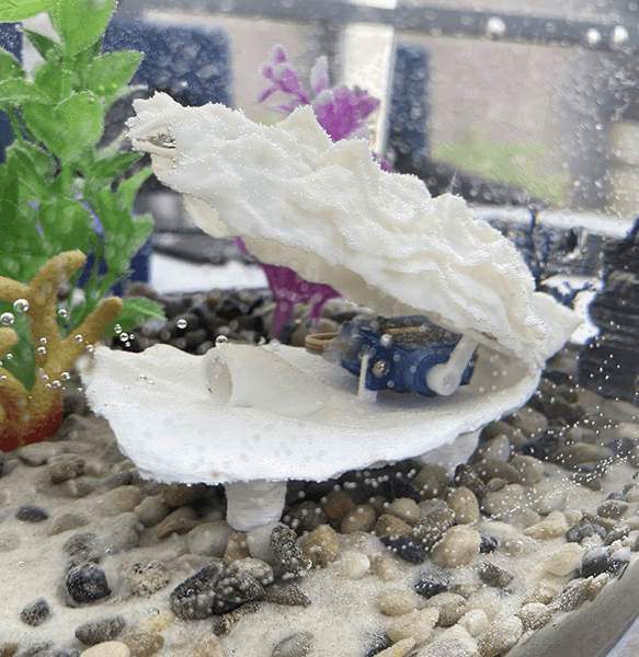
Fig.9, Testing sound responsive robotic oyster co-created with Center for Embodied Autonomy and Robotics (CEAR). Photo by Stephanie Rothenberg
Fig.9, Testing sound responsive robotic oyster co-created with Center for Embodied Autonomy and Robotics (CEAR). Photo by Stephanie Rothenberg
Fig.9, Testing sound responsive robotic oyster co-created with Center for Embodied Autonomy and Robotics (CEAR). Photo by Stephanie Rothenberg
"Tending Ostreidae: Serenades for Settling," led by Suzanne Thorpe, is a interdisciplinary media project that explores how anthropogenic noise in New York City’s busy waterways impacts marine organisms, specifically oysters. Oysters play a crucial role in aquatic ecosystems as water filters, sea level mitigators, and essential components of the food chain. Unlike many marine animals using chemical exudates or light patterns, oysters determine settlement habitats through distinctive sound signatures, while also being sensitive to disruptive loud sounds at specific pitches. Thorpe commences this project by collecting underwater sound recording and marine acoustic ecology research (fig.5 & fig.6), later expanding it into an immersive installation (fig.7 & fig.8). Here she creates a sculptural components resembling oyster reefs that nestles robotic sound responsive oysters (fig.9) with video projections that circulate through various imagery including real time maritime traffic data in New York Harbor and hydrodynamic modeling that visualize water and noise pollution. In the installation, robotic oysters respond to both direct and ambient sounds in the space, along with marine traffic data indicating the presence of noisy marine craft in specific locations within the NY Harbor (Rothenberg, 2023). The sounds triggering the robotic oysters are a blend of field recordings from local oyster reefs in NY Harbor and dynamic synthesized sounds. The composition incorporates a responsive multichannel generative sound design influenced by real-time maritime traffic data and weather conditions, portraying an aquatic environment with a chimeric quality (Rothenberg, 2023). In this way the soundscape, composed of local field recordings of an oyster reef and synthesized sound, as well as visualizations, with animated graphics depicting water flows and the oysters’ lifecycle, offers unique perspective and engagement on how various organisms, typically oysters, engage with their surroundings.
As demonstrated by Thorpe's project, the connection between visualizations and the marine soundscape not only enriches our understanding of oyster behavior but also crafts an immersive experience resonating widely. This harmonious interplay between data visualization and sonification doesn't just enhance comprehension of complex datasets; it introduces a layered and multi-dimensional perspective to information exploration. Through the conversion of visual data into sound and vice versa, this fusion actively engages our primary human senses—sight and hearing—adding depth to our understanding. The visual elements contribute spatial and contextual representation, while auditory components introduce a temporal dimension, providing a more cohesive grasp of the information's intricacies. Furthermore, this dynamic synergy accomodates to a diverse range of cognitive preferences and learning styles. Some individuals may find it more intuitive to interpret information visually, while others may resonate better with auditory signals. Thus, the combination of data visualization with sonification improves inclusivity and accessibility in information conveying, creating the door for a richer and more engaging exploration of complicated datasets.
V. Conclusion
V. Conclusion
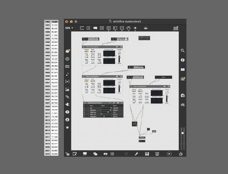


Fig. 10 Datasets of deforestation frequency from 1960s-2020s
Fig.11 Sonification process in software Max MSP
Fig. 10 Datasets of deforestation frequency from 1960s-2020s
Fig.11 Sonification process in software Max MSP
Fig. 10 Datasets of deforestation frequency from 1960s-2020s
Fig.11 Sonification process in software Max MSP
Fig.12 Data Sonification & Data Visualization Final Piece of Deforestation, Link
Fig.12 Data Sonification & Data Visualization Final Piece of Deforestation, Link
Fig.12 Data Sonification & Data Visualization Final Piece of Deforestation, Link
The incorporation of data visualization and sonification into artistic practices is not yet widespread within the artist community, largely due to the perceived difficulty of learning the associated technologies and software, which can be time-consuming. However, as a student and designer intrigued by the evolving possibilities in the art world, I have personally embraced this field in my work. In a recent project focusing on the theme of global warming, I gathered datasets detailing the frequency of natural disasters, particularly deforestation and floods, spanning the years 1960 to 2020 (fig.10) Using Max MSP, a composition software, I translated these numerical values into audio signals (fig.11). To infuse an artistic dimension, I manipulated the resulting audio signal by layering it with raw sounds of nature, such as water for floods and wind for deforestation. Additionally, I introduced a melodic background by altering pitch, timbre, dynamics, and tone to enhance the musical quality of the piece. To complement this sonified data, I created a visual media clip featuring AI-generated images of these natural disasters in a sequential progression (fig.12). Through the synergistic use of data sonification and visualization, I aimed to present an art piece that conveys both the message and raw information of the data to the audience in a unique and abstract manner. While conventional methods of creating art still prevail, I believe that in a world embracing limitless technological possibilities, the concept and technical approach of data representation should be encouraged as a more accessible medium for artists to explore and challenge
The incorporation of data visualization and sonification into artistic practices is not yet widespread within the artist community, largely due to the perceived difficulty of learning the associated technologies and software, which can be time-consuming. However, as a student and designer intrigued by the evolving possibilities in the art world, I have personally embraced this field in my work. In a recent project focusing on the theme of global warming, I gathered datasets detailing the frequency of natural disasters, particularly deforestation and floods, spanning the years 1960 to 2020 (fig.10) Using Max MSP, a composition software, I translated these numerical values into audio signals (fig.11). To infuse an artistic dimension, I manipulated the resulting audio signal by layering it with raw sounds of nature, such as water for floods and wind for deforestation. Additionally, I introduced a melodic background by altering pitch, timbre, dynamics, and tone to enhance the musical quality of the piece. To complement this sonified data, I created a visual media clip featuring AI-generated images of these natural disasters in a sequential progression (fig.12). Through the synergistic use of data sonification and visualization, I aimed to present an art piece that conveys both the message and raw information of the data to the audience in a unique and abstract manner. While conventional methods of creating art still prevail, I believe that in a world embracing limitless technological possibilities, the concept and technical approach of data representation should be encouraged as a more accessible medium for artists to explore and challenge